Read a Casino Lobby Screenshot Through Its Visual Hierarchy
Casino lobby screenshot reading helps you describe a saved interface clearly, map its visual hierarchy and write a caption without guessing how features work.
What can a casino lobby screenshot tell you about the order in which its contents meet the eye? Casino lobby screenshot reading can reveal how a saved screen arranges cards, labels, colour and empty space. It can also help you describe that arrangement without turning a still image into a story about how the service works.
Open the file in Preview, Photos or another image viewer, and keep the whole frame on screen. If you want to annotate it, duplicate the image first so the original stays untouched.
Trace the path the eye is invited to follow
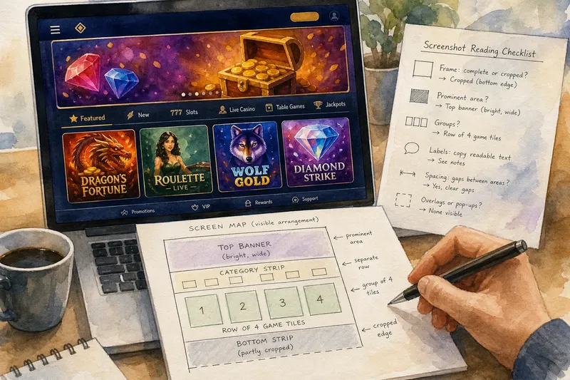
Start with the largest or most visually prominent area, then follow the layout towards smaller groups. A wide banner, a row of illustrated tiles and a narrow category strip can create a visible sequence even when the screenshot does not reveal which element is interactive.
Describe position and prominence rather than presumed purpose. “A bright banner sits above a row of cards” records a layout. “The banner is designed to make users choose a particular game” claims an intention the image cannot establish.
Notice how colour, scale and spacing guide attention. A vivid tile among muted cards stands out; a broad gap may separate two groups. Those are features of the composition, not proof of what a visitor noticed or did.
Describe the composition with a simple screen map
Sketch a rectangle for the screenshot and label the areas you can distinguish: “top banner”, “category strip”, “card row” or “lower edge”. Keep the sketch loose. Its job is to preserve the visible arrangement, not recreate every pixel.
- Frame: If all four screen edges are visible, mark the image as a complete frame; if an edge cuts through content, mark it as cropped and do not extend the map beyond what appears.
- Prominent area: If one panel is visibly larger or brighter than nearby elements, mark its position and appearance; if several areas compete for attention, describe them separately rather than naming a single focal point.
- Groups: If cards share a clear row or column, outline that group; if the alignment is uncertain, draw separate boxes and leave the relationship open.
- Labels: If a word is legible, copy it exactly; if it is blurred or clipped, mark it as unreadable instead of completing it from context.
- Spacing: If a gap clearly separates two areas, show it on the map; if the boundary is unclear, use a dotted line or a question mark rather than a solid border.
- Overlays: If a banner or pop-up covers part of the screen, mark the covered area; if the underlying content is hidden, leave it unmapped.
For each item, the decision is simple: record what the image makes visible, or mark the detail as unclear and avoid filling it in. Keep the original beside your sketch so another reader can compare the map with the frame.
Use visual hierarchy to explain the layout, not behaviour
In interface design, visual hierarchy describes how differences in size, contrast, placement and spacing make some elements more prominent than others. A screenshot can support a description of that arrangement. It cannot establish whether a button responds, whether a card moves or what a label means beyond its visible wording.
Say you have an invented screenshot with a wide, bright banner above four illustrated tiles, while a dark strip runs along the bottom. You note the banner’s position, count the visible tiles and mark the lower strip as a separate area. If the bottom edge cuts through the strip, your map shows it as cropped; the resulting description can explain the screen’s visible hierarchy without claiming what the strip contains or does.
Which details can a screenshot settle?
Can a still image reveal what a button does?
It can show the button’s visible label, colour, shape and position. The effect of tapping it remains unknown from the image alone.
How should I record a cropped label?
Copy the readable words and mark the rest as clipped or unreadable. If the missing text changes the meaning, say the screenshot does not show enough to resolve it.
Can two screenshots be compared fairly?
Describe the visible differences in arrangement, cropping, labels and colour first. Unless there is independent context, do not assume the images show the same device, moment or page state.
Should unclear design elements appear in the caption?
Include an element if it is plainly visible, but describe its appearance rather than assigning it a function. That keeps the caption useful without making the image answer questions it cannot settle.
Turn the map into a checkable caption
Write one sentence about the main arrangement and another about any important crop or obstruction. Then compare each claim with the image: retain descriptions of position, colour, shape and readable wording; revise claims about purpose or response if the screenshot does not support them.
For example, “A bright banner sits above four illustrated tiles; the bottom strip is partly cropped” gives a reader a clear account of the composition. It also leaves open what the banner links to and what lies beyond the frame.
Casino lobby screenshot reading is most useful when it names the visual order precisely. Keep the map beside the image, and include a note about the crop whenever it changes what a reader can see.