How Casino Interfaces Stage a Choice
Explore how casino interfaces stage choices through timing, emphasis and transitions, so you can explain how a screen turns a decision into an experience.
Why can two casino screens offer the same choice yet make it feel different? Casino interface design shapes a decision through timing, emphasis and transitions: it can make a choice feel like a pause, a prompt or a quick passage to the next screen. Looking at that choreography reveals how digital casino culture is designed, not just what the controls say.
Timing gives a choice its pace
A choice rarely appears in isolation. It may arrive after a brief animation, remain on screen while other elements move, or give way to a new panel as soon as someone selects an option. Each timing pattern sets a different pace for the encounter.
Notice whether the interface leaves space to consider the options or quickly advances attention elsewhere. A deliberate pause can make a choice feel set apart; a rapid transition can make it feel like one beat in a longer sequence. These are observations about the screen’s rhythm, not claims about what a person will feel or do.
For a HUTECH class discussion, note the order of events: what appears first, what remains visible and what disappears. That sequence says more about pacing than a general description such as “fast” or “slow”.
Visual emphasis directs attention around the choice
Colour, scale, contrast and movement can make one part of a screen stand out from another. A bright button beside subdued explanatory text, for instance, creates a different visual relationship from a quiet control surrounded by equally prominent information.
Look at the whole composition rather than treating the most vivid element as the only meaningful one. Ask what shares the screen with the choice: a game image, a rules link, a promotional panel or a decorative animation. Their relative prominence helps explain the interface’s visual priorities.
Describe the arrangement in concrete terms. “The animated panel occupies the centre while the rules link sits in a corner” is more useful than guessing why the design places them there.
Transitions shape the sense of movement
A transition connects one screen state to another. A panel might slide aside, a selection might gain a border, or the interface might replace the current view with a new one. These changes provide a sense of movement and continuity, even when the underlying action is simple.
Check what remains recognisable across the transition. If the selected option stays visible, the next state may feel connected to the previous one. If the screen changes completely, the relationship may depend on a heading, a repeated label or another cue.
When movement carries the sequence, ask whether a still element also explains the change. A label that remains readable can anchor the transition without requiring the viewer to infer meaning from animation alone.
How do timing, emphasis and transitions work together?
What should I note about a screen’s timing?
Record what appears, how long it remains in view, and what event moves the interface onward. If the sequence offers no clear pause or trigger, describe that ambiguity rather than assigning a motive.
How can I describe visual emphasis?
Name the features that stand out, such as contrast, placement, size or motion, and compare them with nearby information. If several elements compete for attention, record their positions and roles instead of declaring one universally dominant.
What makes a transition easy to follow?
Look for something carried across the change, such as a repeated option name, a stable heading or a visible selection marker. If no cue persists, note which connection between the prior and next screen is left unstated.
How can I compare two interface sequences?
Use the same kind of starting point and describe the order, emphasis and transition on each screen. If the starting states differ, record that difference first so the comparison does not confuse different sequences with different design choices.
A six-part observation list keeps the critique specific
For each item, record what is visible, then choose the next observation according to what you see. This keeps the discussion focused on screen choreography rather than speculation about intent.
- Opening cue: Check which element appears first; if it names the choice, trace when the options arrive, and if it does not, record the opening cue before deciding what the sequence foregrounds.
- Pause: Check whether the choice remains on screen while other elements move; if it does, note what stays available to read, and if it does not, track what replaces it.
- Emphasis: Check which element has the strongest contrast or movement; if it is a control, compare its prominence with nearby explanations, and if several elements compete, describe their placement and relative treatment.
- Context: Check whether rules or explanatory text share the same view as the choice; if they do, note their location, and if they do not, record which screen or link contains them.
- Transition cue: Check whether a heading, option name or marker persists after a change; if it does, identify the cue, and if it does not, note that the connection between states is not visibly carried forward.
- Promotional element: Check whether an invitation appears alongside the decision; if it is visually separate, describe that separation, and if it overlaps or competes with the choice, record which elements share the space.
An invented screen shows how pacing changes the reading
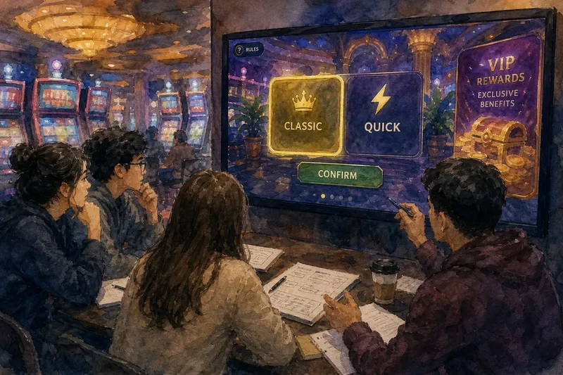
Imagine a fictional HUTECH seminar reviewing an invented casino interface. The starting screen has two options labelled “Classic” and “Quick”, with “Classic” selected, a rules link and a promotional panel. The group records that the choice remains visible while the panel moves; the “confirm” control appears only after that movement finishes.
Next, the students follow the sequence on the screen. They note that pressing “confirm” replaces the options with a new view, where the heading “Classic” remains visible but the rules link does not. Their resulting decision is to describe the transition as connected by the repeated option name, while noting that the rules context is no longer present. They do not infer what the control does beyond the change the fictional screen displays.
That kind of account makes the search phrase casino interface design useful as a lens: it connects visible timing, emphasis and transitions to the way a choice is staged. In a real critique, keep the screen’s sequence and your interpretation in separate sentences; that small discipline makes lively design details easier to discuss without turning them into unsupported claims.